Sunday, February 2, 2025

 The Three-Part Project- The second piece

Sarah and I met first on the Eastern Europe trip. I must have irritated her with my questions about what are we doing about backpacks- leave them on the bus? How cold or hot will it be- what are we doing about jackets? Will it rain-Are we carrying raincoats?  Through all these silly questions, Sarah never lost her calm demeanor and patiently answered what they were doing. 

Her two boys were traveling with her too. Cal was curious and interested in everything, and had done his homework about the places we visited. Auschwitz however troubled him too much to actually visit, and he opted to stay away.

Matthew went about everything with the most serene expression, and lost in thought. Sarah paid equal attention to both boys, who sometimes walked together, sometimes not. 

On our last stop which was Budapest, we had a four hour session in the hot baths. Both Sarah and I had had enough of the hot water in about an hour and got out. I have rarely gone looking for a particular building or tourist spot off the guided tours, but that day I had no worries. Sarah and I walked along a park to a cathedral, which also had a museum and gift shop. We admired the hand embroidery and crochet and picked up a few mementoes. We discovered we loved the same crafts and art. That started a wonderful friendship too.


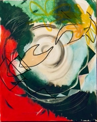
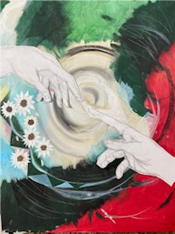
In this piece I wanted to bring out the Circle and Hands motif. In Cal's painting, the circles were the sunflowers and one vinyl record, besides the background was the swirling graphic which was a whirlwind- up for interpretation depending on how one sees it.

Sarah's piece was 20 x 24, a larger canvas (pun intended). In the beginning, she did not know that I was going to represent her as well into the art she commissioned. That is why although the middle piece was to be an amalgam of both the boys' personas, I called it Sarah's piece. It was also true in another way as she is going to keep that one at her house, and let the boys take theirs to their homes when they leave home one day.

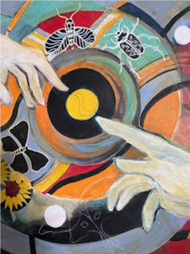
For Sarah's piece, the circles would be the vinyl records, and the Wedding Rings quilt motif. 


I added the sewing machine and a pair of hands, quilting a heart. Here I would like to add that the heart is a favorite motif that appears time and again in my paintings, and is also a part of my signature.

Sarah was posting her quilts for 2024 as she finished them. She is meticulous and fast and her quilts are a pleasure to behold. This one really appealed to me.


 So I used the motifs in it to fill in the blocks of the Wedding Anniversary quilt. 


On the other circle of the Wedding Rings, I used the rainbow colors of the squares from the border of Sarah's colorful quilt.


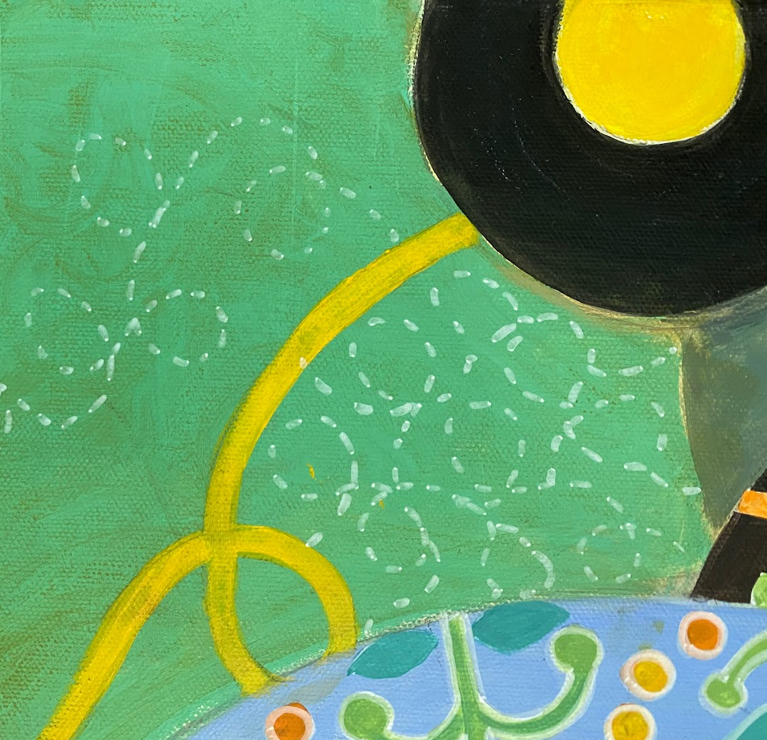
Vinyls peppered the piece from corner to corner. 

Since there were blank areas of color, I added a motif of quilting stitches to one corner of the piece. 


One day on our Iceland trip Sarah went for an early morning walk. She is brave and nothing can stop her once she puts her mind to it. She came back excited for having found a strange (at that time it seemed not only strange but mysteriously connected to the mission she had left on that morning).

Sarah had brought her late parents' ashes to immerse in the ocean at Reykjavik. 

"In a crevice among some large rocks by the Atlantic Ocean in Reykjavik"


It sounded as if someone was directing her to leave the vial right there. And that is what she did. 

I felt compelled to add that visual to the painting. 


I wanted the ribbons running across the piece too. Sarah had shared with me that she has a multi-faith altar at her house and that she prays once a week. Her favorite is The Prayer of St. Francis, and I used two lines that I found most fitting. 

Prayer of St. Francis of Assisi (Prayer for Peace)

Lord, make me an instrument of your peace:
where there is hatred, let me sow love;
where there is injury, pardon;
where there is doubt, faith;
where there is despair, hope;
where there is darkness, light;
where there is sadness, joy.
O divine Master, grant that I may not so much seek
to be consoled as to console,
to be understood as to understand,
to be loved as to love.
For it is in giving that we receive,
it is in pardoning that we are pardoned,
and it is in dying that we are born to eternal life.

The hands needed some work, and the text was added to the ribbon, and Sarah's piece was complete.


Monday, January 27, 2025

THE THREE PIECE PROJECT
The Story begins with Sarah requesting me to make three paintings, one for each of her sons, and one incorporating both. The idea was that she would hang them together on the wall, the bigger one representing them both in the middle, and the other two on either side. I was thrilled to take up this project, little realizing that it was actually a challenge. Sarah was going to gift the two boys their pieces when they moved to their independent residences, and keep the middle bigger one at her house.


We discussed sizes


and I acquired the canvases.


These were not to be portraits, but representations of the souls of the two boys. And they seemed to be poles apart, and probably are. I started on Cal, thinking about what he likes, and what shapes his personality. The most important factor was the Transformation. I really wanted that to be the focus of that painting. I googled the words Reformation, transformation, and several similar words. The chrysalis to butterfly idea did not sit well with me.


Besides, he likes moths and butterflies, which I was going to incorporate in the piece and had researched and sketched a few of those already:

That’s when the most famous image of hands came up. I had to look no further

I am not into realistic painting all that much, so I tried a different approach, more geometrical. I put together a graphic with the colors that came to me just by intuition.


Of course this was a smaller sheet of card stock, and the proportions were not right, and I was not pleased with the hands, the beetles and bugs looked too big, the sunflowers (Cal’s favorite) ambiguous. I reverted to closer to realistic, yet a bit geometrical-looking hands.


These still did not look right to me. In fact they looked bony and eerie.

So finally I went back to more realistic ones, like the ones on the Sistine Chapel ceiling.


On a family weekend, I took my iPad with me and used it to draw a big spiral swirl in the middle of the “canvas”, with the hands transposed on it. That seemed like a good composition, and I could move the other components around it.


I changed the orientation of the hands quickly and exchanged the hands for my realistic looking hands. 


The flowers looked more like daisies, as my husband pointed out, so I changed them into sunflowers, and added colors to the hands. 


At this point I was leafing through an old Illustration book that we had bought back home in India. That was one of my first Art Reference books. One of the color schemes caught my attention:


I liked it so much that It became the color scheme of this set of 3 paintings.

Although the colors of the hands were appropriate, they were too obvious, and I was not liking that, so the hands became lighter and more marble-like.


Much of Cal’s painting was coming together really well, while I continued my research of bugs and moths.


I have to add here that I had already noticed Cal fascinated looking at drawers of bugs in a wonderful museum of Icelandic art on our trip there.


This was the second trip on which Sarah, Cal and I were co-travelers, and I had gotten to know Cal a little better. He is sensitive, creative, and pensive. And he loves sunflowers, bugs, and Luna moths. Plus he writes- Poetry. It was great to meet this creative soul!

So with the addition of the luna moth, the graphic part of the painting was complete. However, I wanted text. I wanted it on a ribbon swirling around the painting, like the new “Threads” app on Instagram.


So it was back to Sarah, my most helpful conduit to the boys. I asked for something – a poem (hopefully Cal’s own- but I doubted that, as he is probably too shy to put that on a painting). I was rewarded with a poem of his choice- “The Mirror” by Sylvia Plath. I just wanted a few lines to go on the center, but I could not truncate the poem anywhere. It’s more of a story. So on it went on the ribbons, all of it. My trusted black and white Posca pens were a big help, and Cal’s painting was complete.


Tuesday, January 16, 2018

Collage- The start of my journey and how I do it

How I started working in collage, and how I do what I do:

Collage is one my favorite medium - or challenge to expression. Done with a few tools and materials, and endless possibilities within the pages of magazines, catalogs, and junk mail.

My tools are: A substrate like a cardboard or canvas, magazines, craft knife, and glue stick.

I first discovered the potential of magazine paper when I was given a stack of magazines that someone couldn’t bear to throw away or recycle. It was called “Victoria”, and is probably defunct now. The pictures were mainly in pastel shades, and the designs were all old-world charm, curlicues, and curves.

Just like the former owner of these magazines, I could not bring myself to cut or tear out the pages- I just marveled at the pictures, or read agony aunt columns and elaborate baking recipes.

But once I got over that hurdle, I realized I had a veritable Pandora’s box of colors in paper that I could use in my “paintings”. My collage journey had just begun.

At first I drew shapes on the colors of the magazine pages I liked, and cut them with scissors.
I learnt that I got better control when I cut out most of the page as close to the desired shape as possible, and moved the paper instead of the scissors.

I use very basic shapes in my designs: Long triangles, or spikes, curved parallels, squares, circles, strips.

I made abstract portraits using these shapes, and these were among the first of my pieces that were sold.

 “Japanese lady” (the image is not very clear), but this was my first sale in my first solo exhibit.
  “Flowers in her hair”,
  “The Belle of the Ball”

I began to use my own paintings as backgrounds, and created geometrical abstracts.
 “The March” This was our most-loved piece, and it graces the home of a good friend.
 “The Wreath” is made almost entirely with long triangle shapes.
----------------------------------------------------------------------------------------------------------------
” Dragonflies”

Substrates are another matter, or sometimes it doesn’t even matter. The above piece, which I sometimes call “Dragonflies”, is actually painted on a piece of foamboard. It was chosen to be featured on the calendar brought out by Peninsula Behavioral Health in Knoxville, TN in 2005.
There was a family-owned store in Morristown, TN- Classic Creations that did my framing for the first year that I started showing in galleries. Vicki and I spoke for hours, both standing on either side of the counter in the small store. I was painting a lot, and custom framing was getting expensive.
Rose Center in Morristown gave me a dozen or more frames at a pittance, and we decided we would start framing our own.
We learnt what went under the glass beneath the paintings. My husband said it would be quite easy to cut mats provided we had the right tools, so we ended up investing in a mat cutter.  
Soon, he did all the matting, and I was the trusted helper to hold the steel ruler so he could cut the sharp bevel edges of the mat. The only condition was that I was stay very quiet (this year's resolution), and not to discuss with him the choice of mat color, or the size of the allowance around the piece. Everything had to be predetermined by me, and he would cut the mat to my specifications.

I was thus left with odd-size pieces of matboard and foamboard and sometimes even glass.

This was the perfect square piece of foamboard and as I love the square shape for most of my painting, I got down to work, and “Dragonflies” was started. The plumeria were painted in colored pencils on Bristol board, and attached. The dragonflies were cut out of the inner liner of a wedding invitation card.


Sunday, May 6, 2012


Trying to do something for Rudy's room: inspired from Chinese cut-outs found on a restaurant menu!

Saturday, May 14, 2011

Memory and Memories


In the soap opera of our lives, memories are episodes. The characters who starred in them are your family and friends--parents, spouse, children, siblings, also neighbors, coworkers, community members.. a wide range of people-from soulmates to mere aquaintances... The ultimate joy is to re-run those memories with them, one scene at a time.. To remember and to remind, to laugh and to lament, to wonder where the other people are now..

Memory is the ultimate gift.. Treasure it if you still have it. Write down your moments to cherish. Returning to a journal entry after a passage of time is an unexpected experience. You get a chance to revisit places, people and moments with a new perspective.

Life and aging takes its toll. Less for some, more for others..I cannot imagine how it feels to someone who cannot remember..especially when they have lived a full life-- and have to stand at the sidelines because they cannot take part. They cannot take part because they cannot remember. They cannot understand references, they feel lost, left-out and utterly helpless.

A slow fade-out of names, faces, events, and finally relationships is a cruel loss. I hope I am able to understand.

Wednesday, July 7, 2010

Gloating over the beauty of nature hundreds of miles away, one forgets what one has in one's own backyard.
This is a chance picture of Cherokee Lake from Panther Creek State Park, just round the corner from our house. When I lived near the ocean in my childhood, I rarely visited the beach. It was always too crowded, too dirty, too polluted, or too hot. When in my adult years I lived in a city on the coast, visits to the beach were more frequent, but now I realize: not often enough.

When you are landlocked, and the nearest beach is at least seven hours away, you long for that proximity to those vast miles of endless water..daunting, challenging, yet strangely calming.
Lakes are fine too.. even man-made ones. Who cares?

They give the same calm, the same silence, and the same awe that the mind needs to feel grateful.

"Everybody should have his personal sounds to listen for - sounds that will make him exhilarated and alive or quiet and calm” - Andre Kostelanetz

Monday, July 5, 2010


Installation created by Medha Karandikar

as part of Tennessee Journey Stories : An Exhibit

by James-Ben Studio & Art Gallery

at the Niswonger Performing Arts Center in Greeneville, TN


Name: A child and his art: growing up in East Tennessee

" When we uprooted this wide-eyed eight-year old from his familiar Indian home, school, country and friends, and brought him to Morristown, he left behind his toys, gave away his beloved Lego pieces, and waited for his favorite picture encyclopedieas to be shipped. All he brought with him was this incredible talent to draw.
We had seen him draw a detailed harbor scene scene from a tiny dinghy.. from memory. Soon, he was drawing cityscapes from imagination: bridges, skyscrapers, stadiums, roads, neighborhoods..
We specially drove him through downtowns of larger cities.. but it was all there in his mind's eye..he didn't need references.
Band happened.. and the introduction to music. Before long he was writing and playing pieces to us.
Ceramics opened a third dimension. A surprise element with glazes and colors.
This is a peek into his world, and the chronicle of the kid as he grew into an adult."