We discussed sizes

and I acquired the canvases.
These were not to be portraits, but representations of the souls of the two boys. And they seemed to be poles apart, and probably are. I started on Cal, thinking about what he likes, and what shapes his personality. The most important factor was the Transformation. I really wanted that to be the focus of that painting. I googled the words Reformation, transformation, and several similar words. The chrysalis to butterfly idea did not sit well with me.

Besides, he likes moths and butterflies, which I was going to incorporate in the piece and had researched and sketched a few of those already:

That’s when the most famous image of hands came up. I had to
look no further

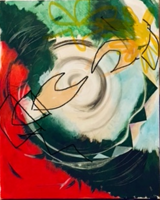
I am not into realistic painting all that much, so I tried a
different approach, more geometrical. I put together a graphic with the colors
that came to me just by intuition.

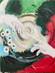
Of course this was a smaller sheet of card stock, and the proportions were not right, and I was not pleased with the hands, the beetles and bugs looked too big, the sunflowers (Cal’s favorite) ambiguous. I reverted to closer to realistic, yet a bit geometrical-looking hands.

These still did not look right to me. In fact they looked
bony and eerie.
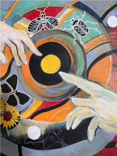
So finally I went back to more realistic ones, like the ones on the Sistine Chapel ceiling.

On a family weekend, I took my iPad with me and used it to
draw a big spiral swirl in the middle of the “canvas”, with the hands
transposed on it. That seemed like a good composition, and I could move the
other components around it.

I changed the orientation of the hands quickly and exchanged
the hands for my realistic looking hands.
The flowers looked more like daisies, as my husband pointed out, so I changed them into sunflowers, and added colors to the hands.

At this point I was leafing
through an old Illustration book that we had bought back home in India. That
was one of my first Art Reference books. One of the color schemes caught my
attention:

I liked it so much that It
became the color scheme of this set of 3 paintings.
Although the colors of the
hands were appropriate, they were too obvious, and I was not liking that, so
the hands became lighter and more marble-like.
Much of Cal’s painting was coming together really well,
while I continued my research of bugs and moths.


I have to add here that I had already noticed Cal fascinated
looking at drawers of bugs in a wonderful museum of Icelandic art on our trip
there.


So with the addition of the luna moth, the graphic part of the painting was complete. However, I wanted text. I wanted it on a ribbon swirling around the painting, like the new “Threads” app on Instagram.

So it was back to Sarah, my most helpful conduit to the boys. I asked for something – a poem (hopefully Cal’s own- but I doubted that, as he is probably too shy to put that on a painting). I was rewarded with a poem of his choice- “The Mirror” by Sylvia Plath. I just wanted a few lines to go on the center, but I could not truncate the poem anywhere. It’s more of a story. So on it went on the ribbons, all of it. My trusted black and white Posca pens were a big help, and Cal’s painting was complete.


2 comments:
Wow medha so creative I liked the concept u have taken great efforts to paint this colour combination is superb. End result is very nice please do share second part
Wow Medha this is absolutely amazing. What a beautiful journey of your creation. Love love love. ❤️
Post a Comment